Group Assignment | Final Semester | Specialist Diploma in Motion Graphics Design
Art direction and illustration by me.
Overview
Rehabify is a branding and design project aimed at reimagining physiotherapy as something fun and accessible for people of all ages.
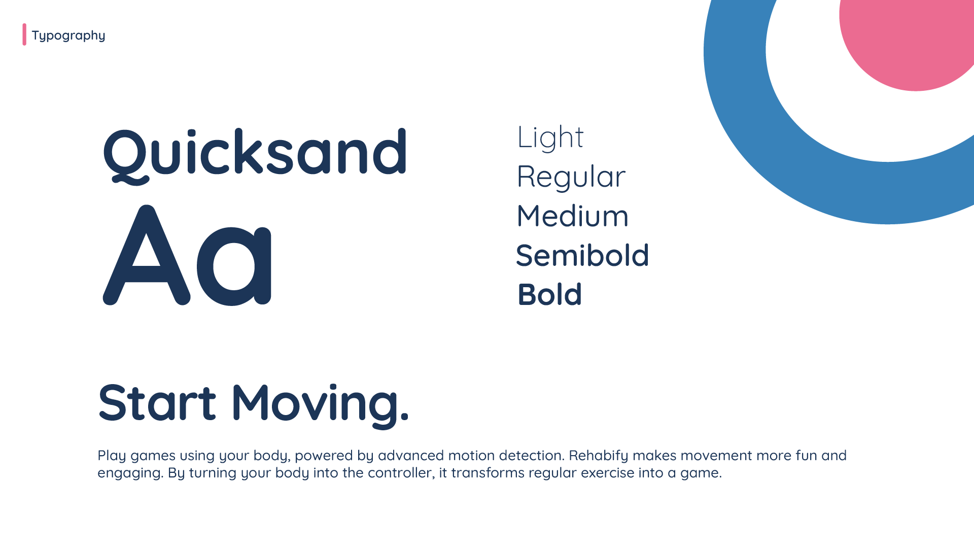
The goal was to create a playful, inclusive, and modern identity that connects with youth, adults, and seniors. The project included logo redesign, stylescapes, and brand applications such as app mockups and social media visuals.
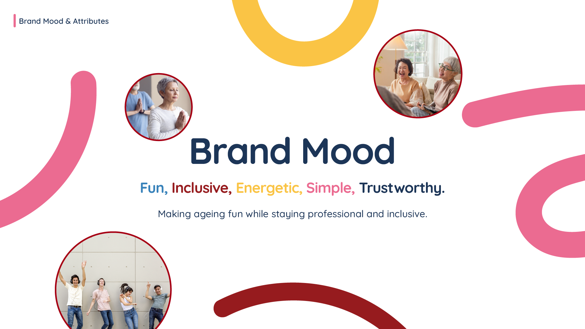
Concept
Ageing is often seen as serious, but Rehabify wants to make it fun, active, and social.
We designed a brand that:
• Feels energetic and approachable.
• Works across different generations.
• Can adapt to digital platforms and gaming-inspired interactions.
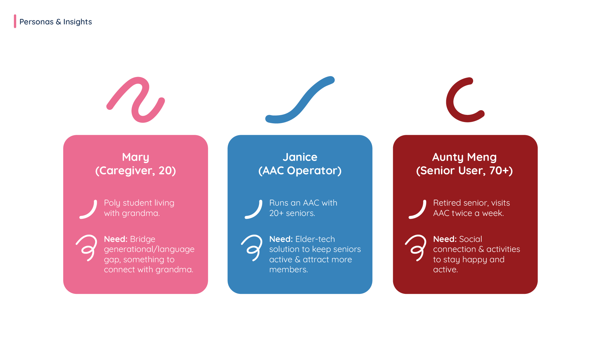
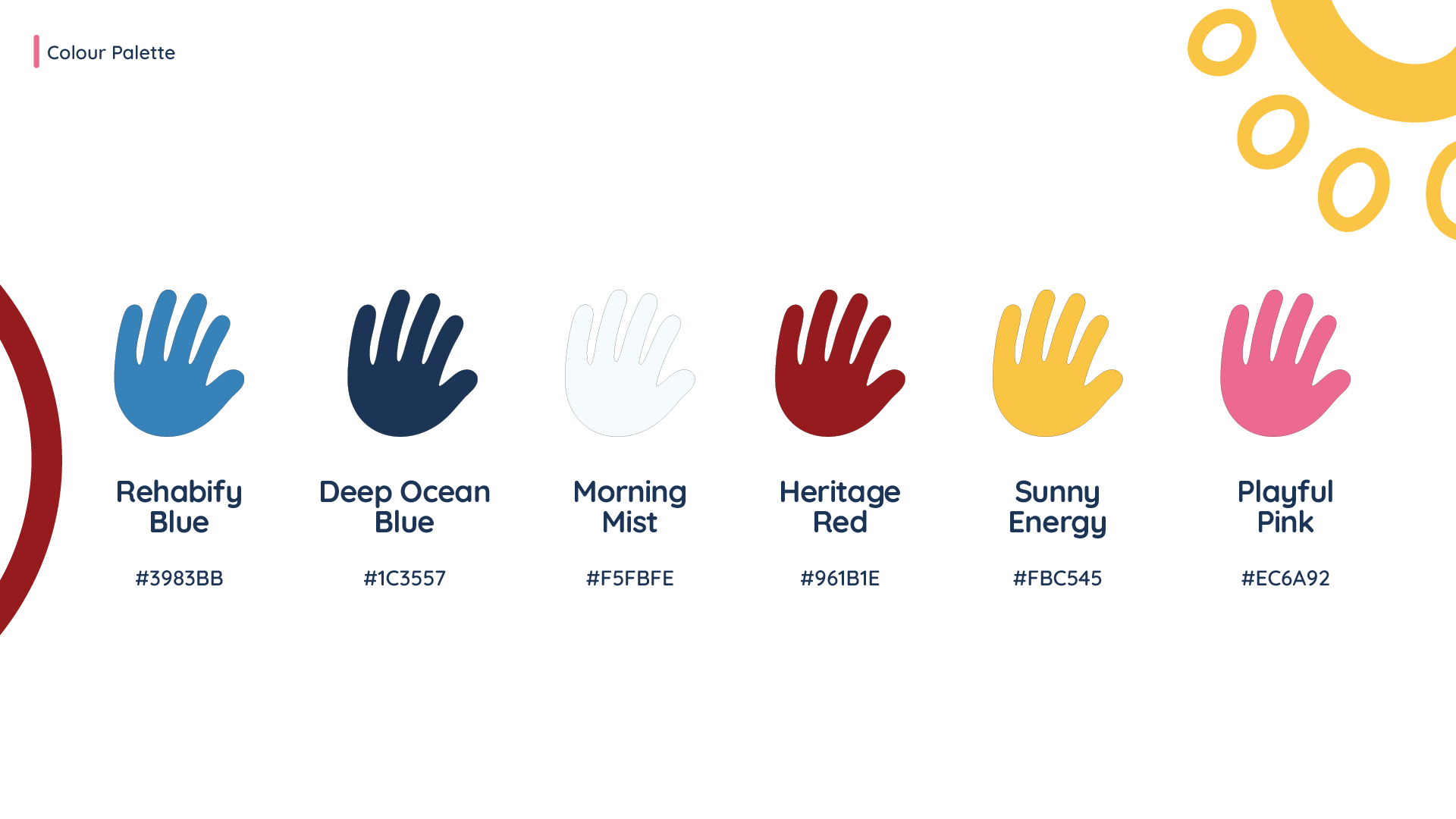
The concept was supported by user personas (youth, adult, senior) that guided the design tone and colour palettes.
Stylescapes
We created 3 stylescapes for each persona:
• Youth – Bright, playful, game-like.
• Adult – Practical, structured, reliable.
• Senior – Warm, authentic, familiar objects like cups and spices.
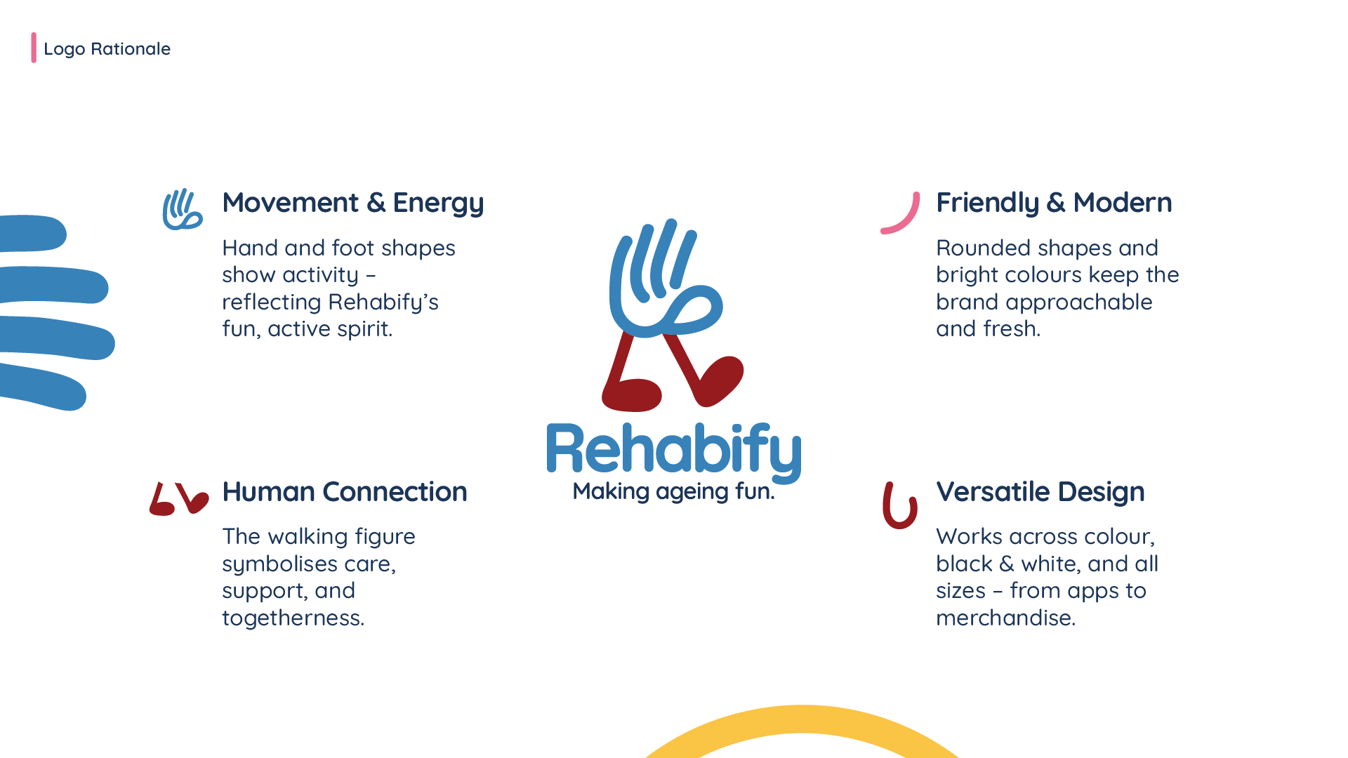
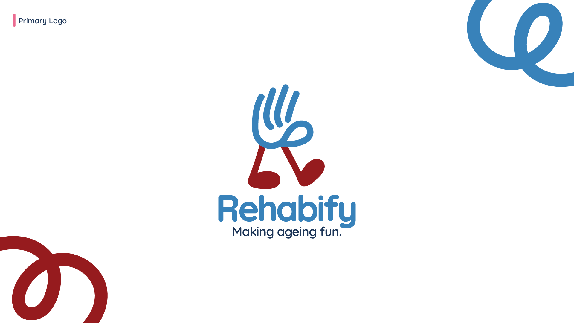
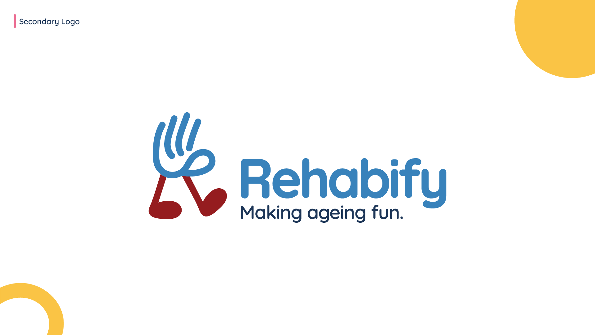

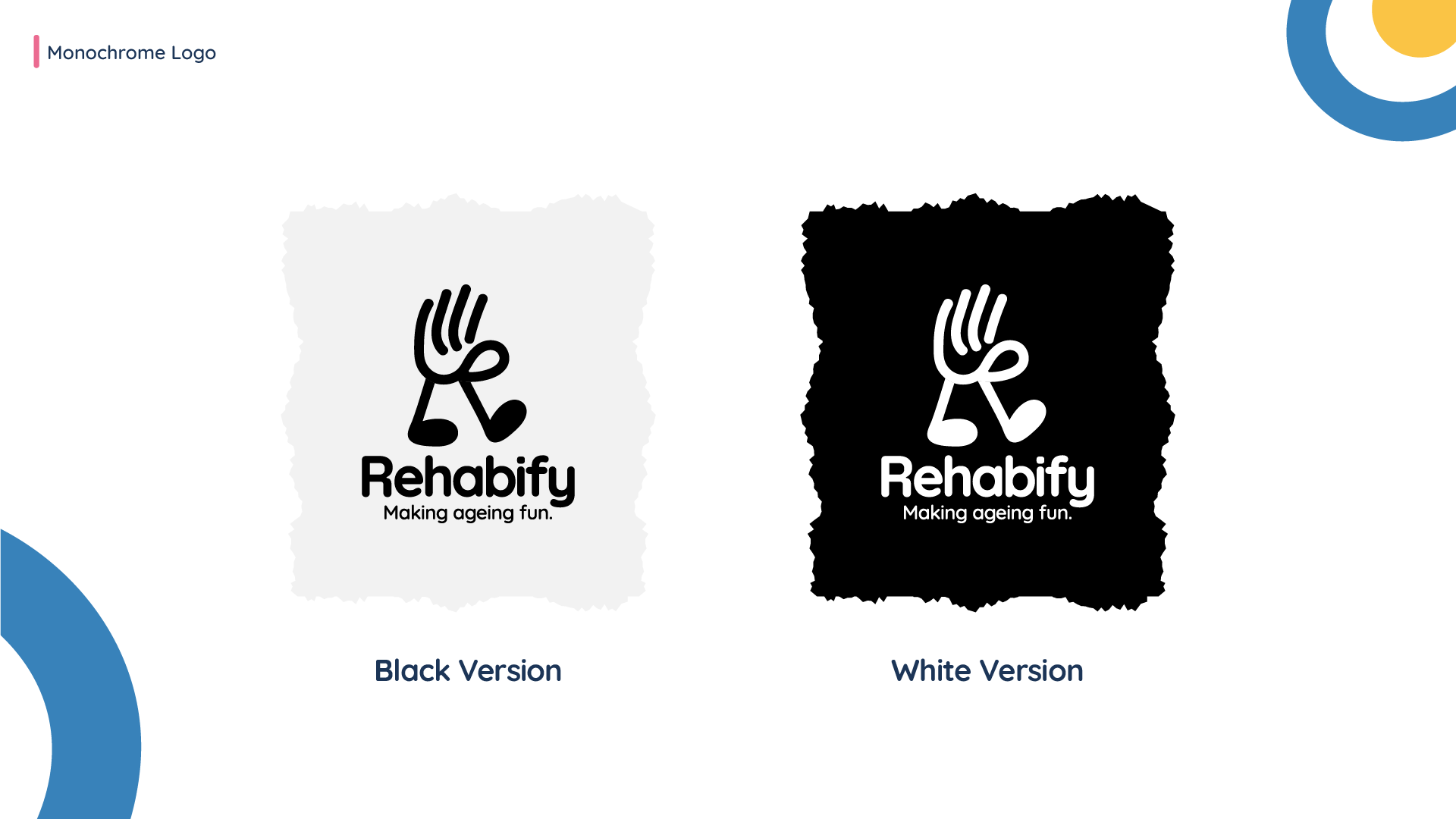
Logo Redesign
• Simplified the original abstract “R” into something more playful and modern.
• Explored mascot ideas (e.g., an otter) to make the brand friendly.
• Designed logos that can be used in full, submark, and app icon formats.
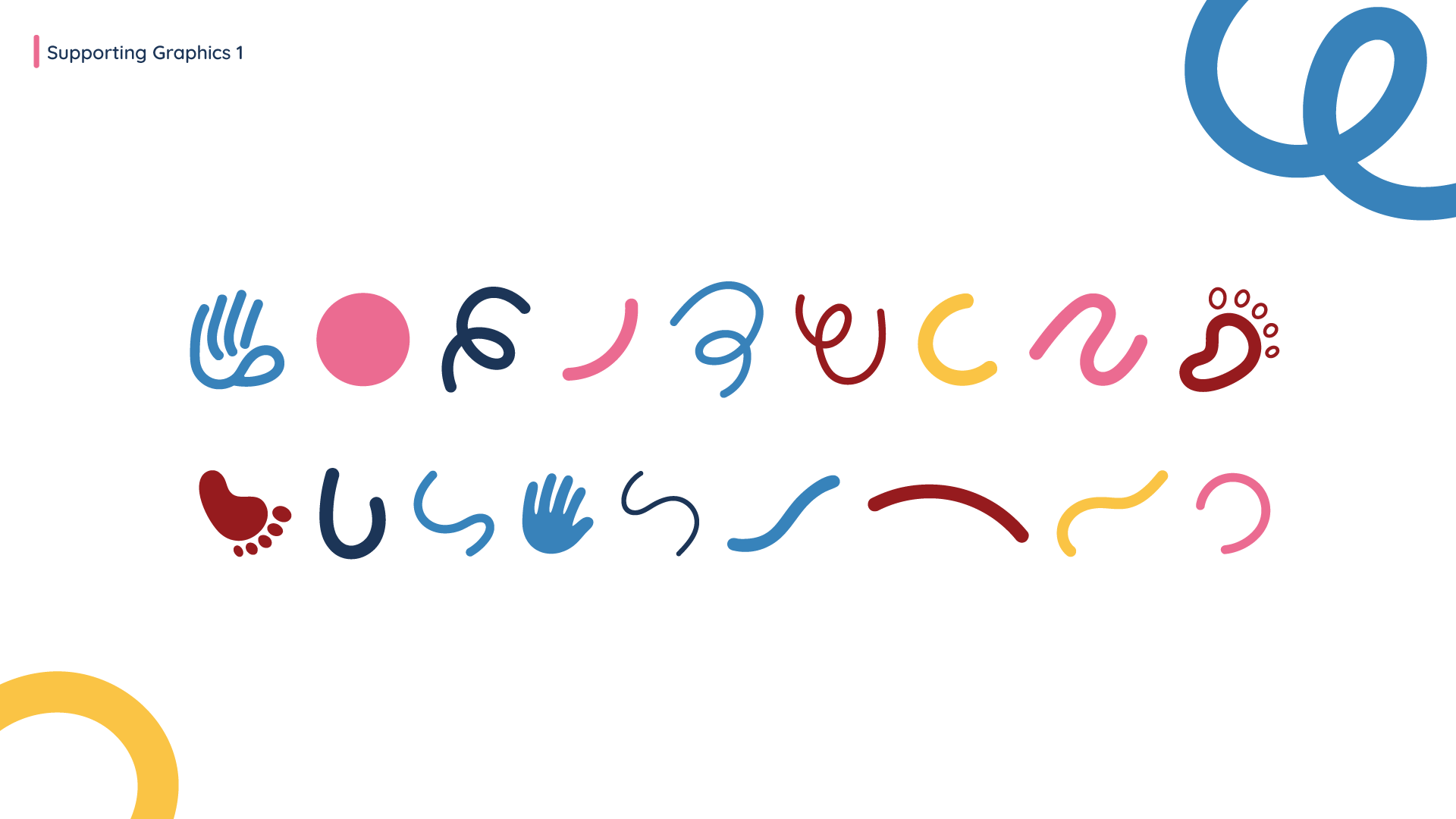
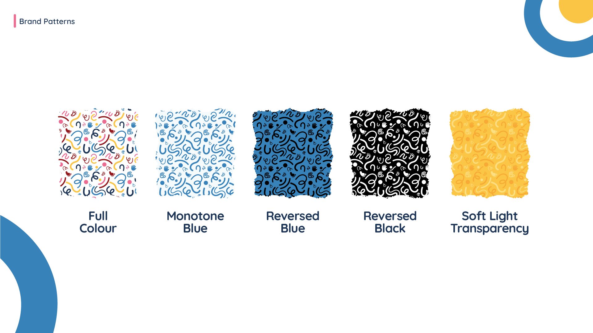
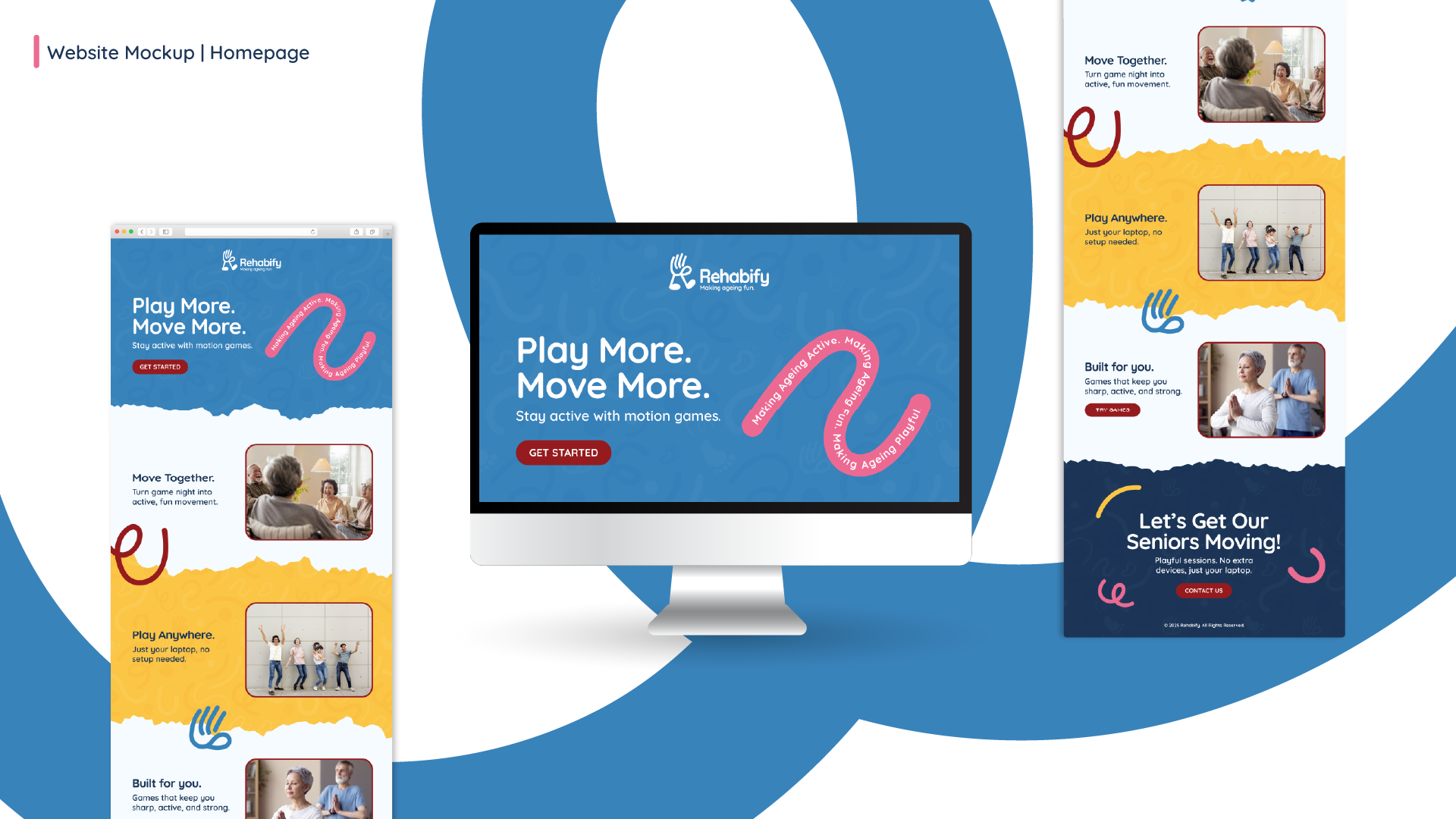
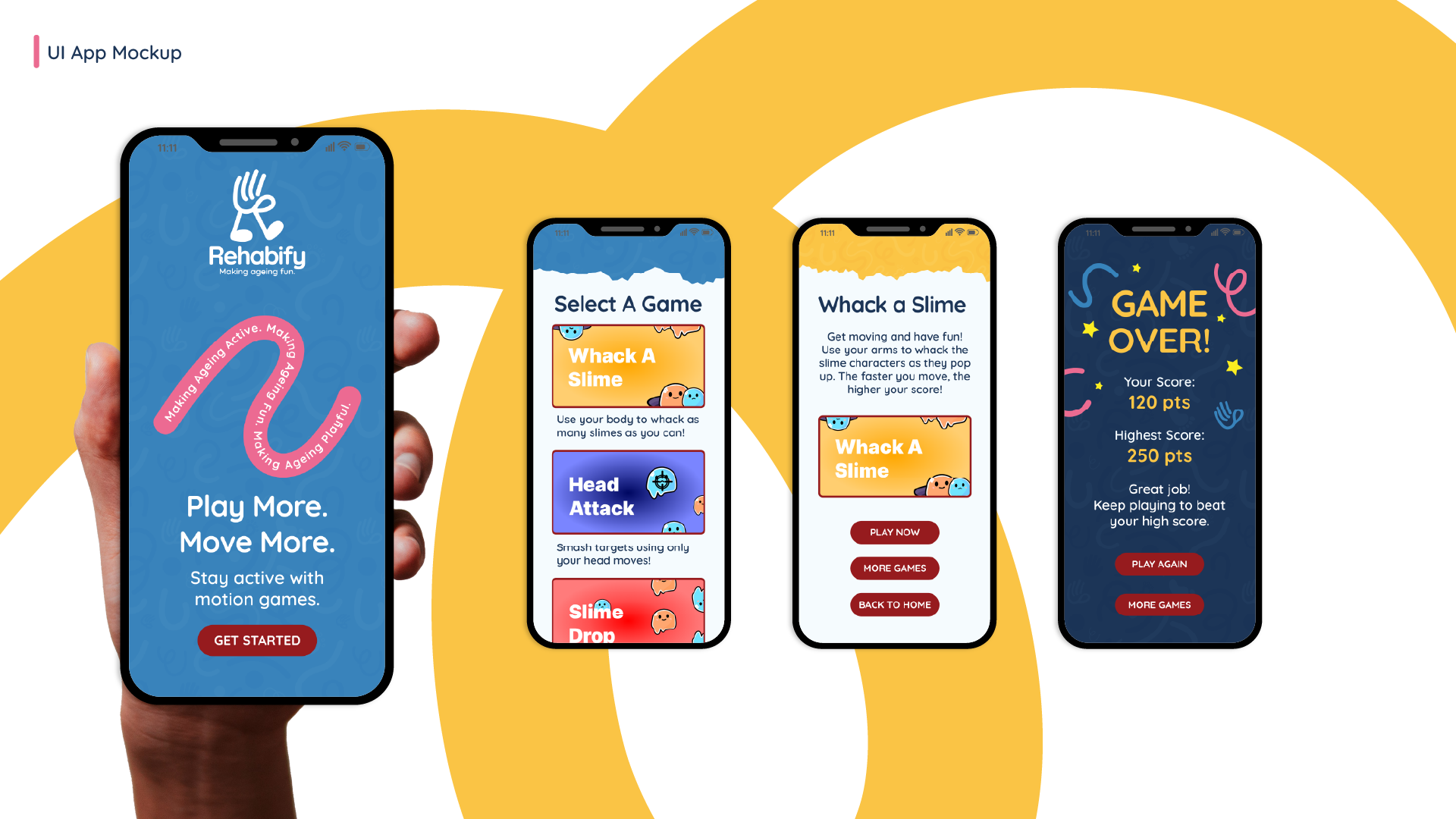
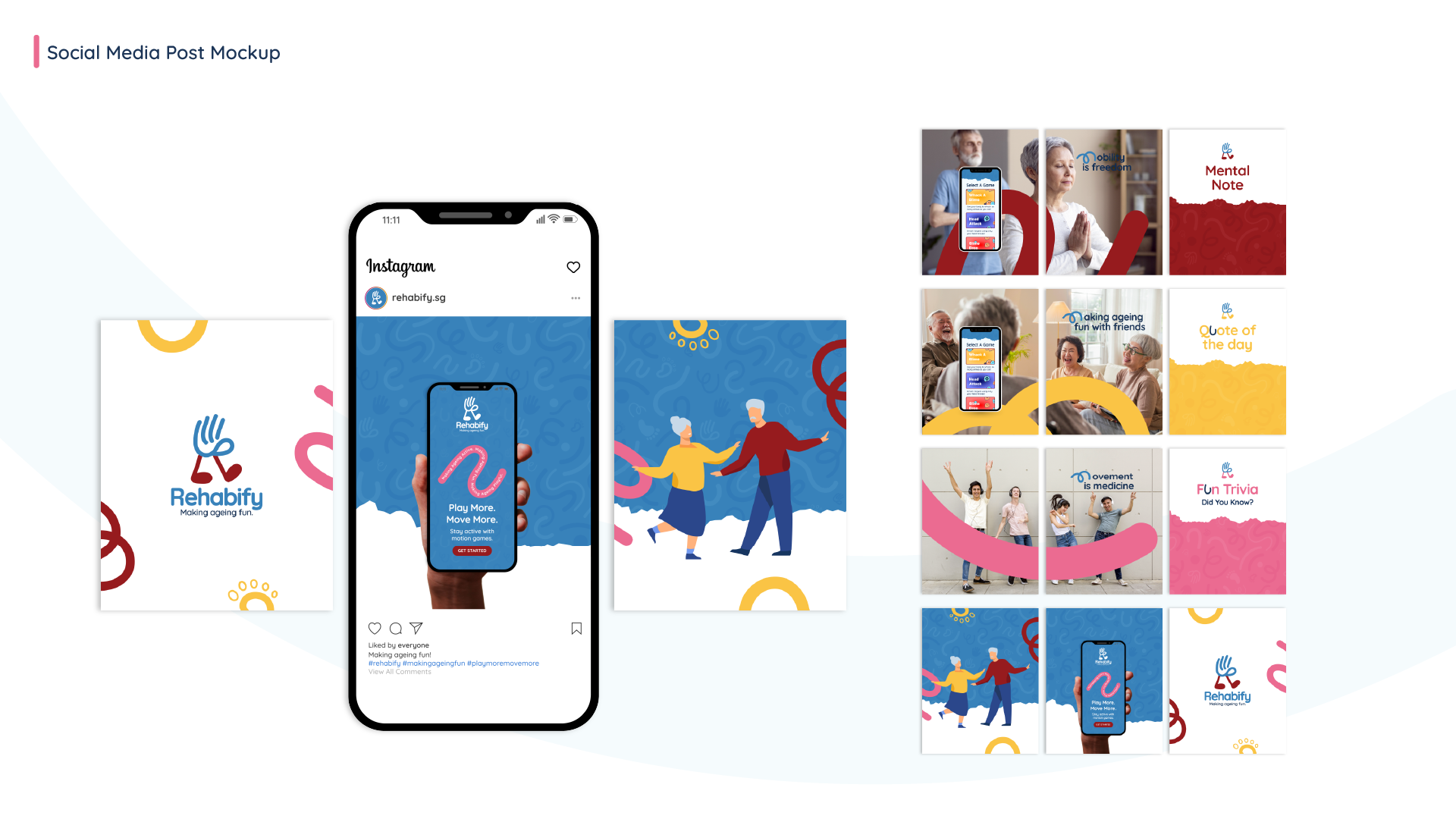
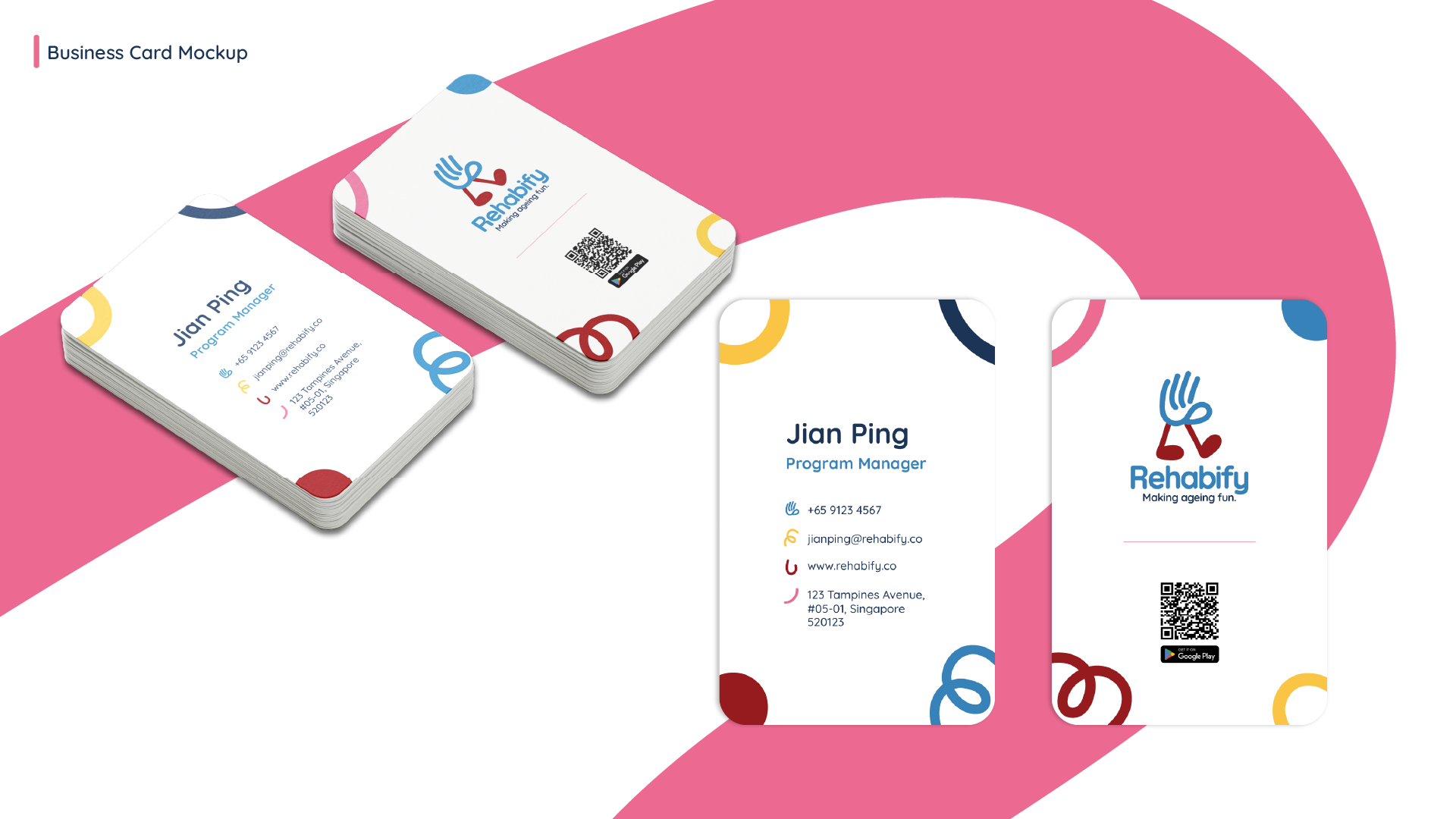
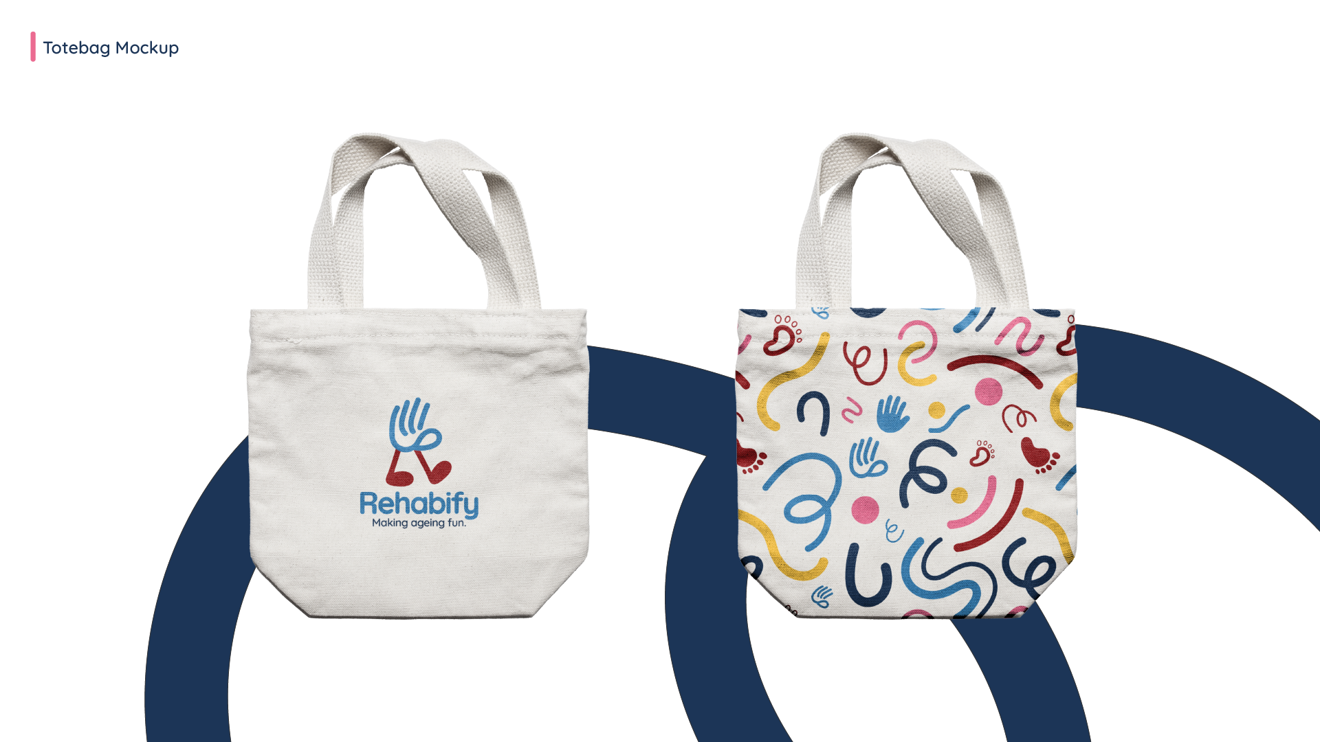
Brand Applications
Reflection
This project taught me:
• How to translate feedback from different user personas into design.
• How to balance playfulness, cultural familiarity, and accessibility.
• The value of making a brand that feels inclusive across ages.
Rehabify showed me how design can turn something like physiotherapy into an experience that feels fun, energetic, and social.